Space plays an integral role in the art creation process.
Even the slightest change in space can impact the dynamics of art.
The way you comprehend art and later visualize it in your mind can be influenced by just a few modifications.
If you look at Da Vinci and Michelangelo’s art, you’ll understand how brilliantly they have made use of space art elements.
Their art, Last Supper and The Creation of Adam, had a mysterious tone—a storyline and intriguing setting that couldn’t be established without the support of space art elements.
Space between characters can even manipulate viewers.
And it’ll be unfair to say that space isn’t complex; it’s full of complexity, and the level can be set by the artist himself.
The use of space is fascinating and rewarding, especially when you want to leave a lasting impact with limited efforts in regards to painting.
So, let’s explore various kinds of space in art, and learn the role it plays in sculpting your perspective.
Table of contents
What is the Space element of Art?
Space is nothing but an area you see in a painting, a picture, or an artwork that is either inside or outside of the subject matter.
It’s one of the seven elements of art and can be used to add depth, meaning, and perspective to an artwork.
Types of space in art
Although several kinds of space elements of art exist, we’ll mainly cover four, which mostly help artists convey a message, remove the clutter, create a balance, and add illusion as per their convenience.
Art isn’t only about how well you have imitated figures on a canvas, it’s also about how seamlessly and efficiently you have used different elements of art.
Space, being the most prominent art element, adds interest and depth, making a composition worth-exploring.
Here are four kinds of space elements:
A. Positive and Negative Space
Positive and negative space elements of art are the two sides of a coin.
Both play a unique role in driving the viewer’s attention to a focal point.
No matter which type of art you make, whether it’s landscape, realistic, or abstract, negative and positive spaces exist to leave an impact on the viewer.
Positive Space:

Positive space is nothing but the space used in a composition.
It can be a person, an object, or anything that’s an active part of a work.
It’s about creating an interesting area in a painting that is equipped with details and characteristics.
Creating a positive space can be a simple and complex task, depending on what you want to convey and how you want your viewers to perceive your work.
If I had to give you a positive space element example that is simple in nature, I’d show “The Creation of Adam” by Michelangelo.
The God and Adam on both sides of the composition have their index fingers about to touch.
Its background, which is unused, is considered the negative space.
It helped positive space to create a single focal point, which was the area between their index fingers.
Michelangelo’s art doesn’t display various focal points; it shows one that is backed by negative space, i.e the seemingly natural and cluttered free background.
On the other hand, A Sunday on the Island of La Grande Jatte, a painting by Georges Seurat, shows multiple focal points.
It creates various points of interest because of its human figures, animals, and natural elements.
Maybe, the girl with an umbrella under the shadow on the left can be the initial focal point. However, eyes travel from one point to another because of the equivalent impact left on each element.
Although the work isn’t very complex, it can be considered one in regards to focal points.
The objective behind it wasn’t to distract the viewer or hinder its attention span, it was to occupy them with the various subjects and objects.
(Read: Balance in Art)
Negative Space:

Negative space is the inactive area surrounding a subject or a figure in a composition.
It helps positive space create its impact and be the focal point in the composition.
Apart from that, it produces an emotional effect, directs eyes to the primary object, and simplifies the image.
There can’t be positive space without negative art space. It’s what makes the positive space element of art alive, active, and appealing.
Artists strategically leave more negative space to elevate emotions.
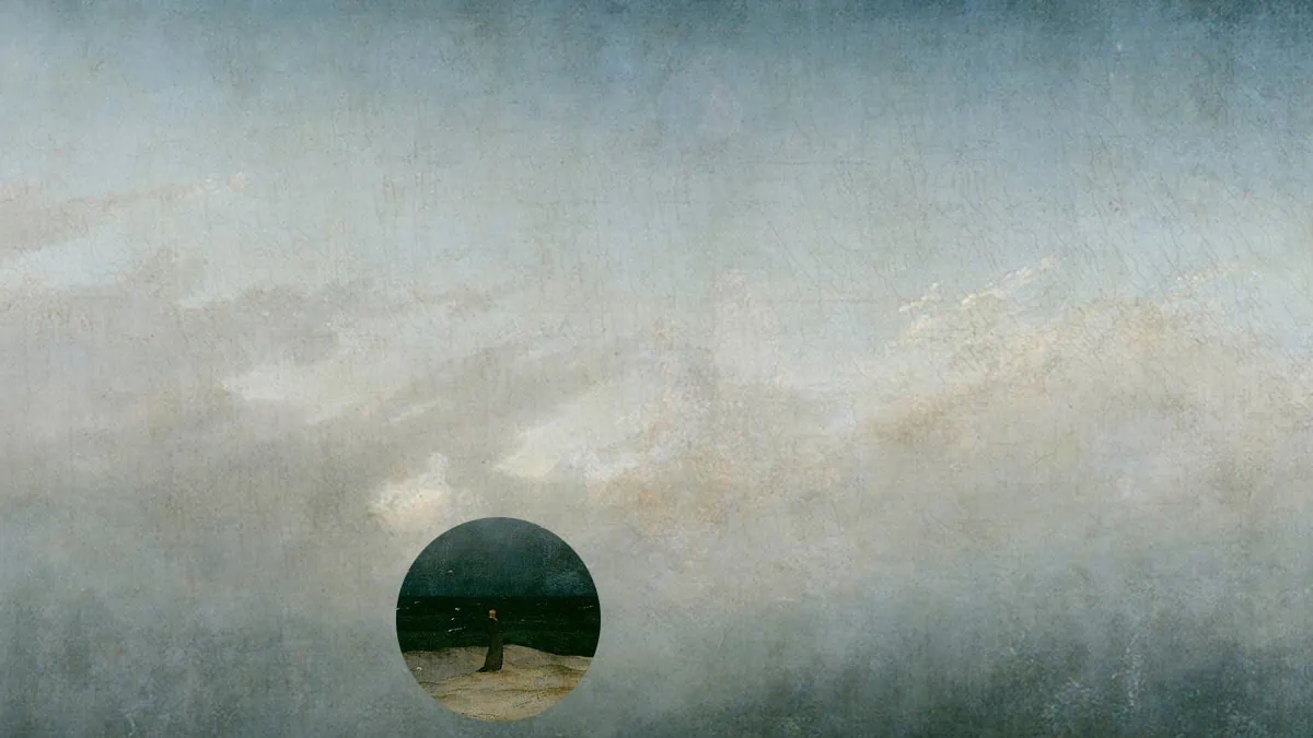
If you look at Caspar’s The Monk by the Sea, the subject is at the seashore, and the gloomy background sets an unsettling, chaotic mood.
The background isn’t filled with so many colors, nor does it show an unorganized or inactive area.
But it’s a wide composition and leaves an extra space surrounding the monk. Thus, it makes the monk, the primary subject, appear smaller.
That’s how lots of empty space drives your eyes to the subject (the positive space of art) effortlessly.
(Suggestion: Rhythm in Art)
B. Deep and Shallow Space

Both deep and shallow space in art deal with adding depth to the composition.
In deep space, we can see the figures from the foreground, middle ground, and background; basically, we view subject matters closer and farther away from the viewer.
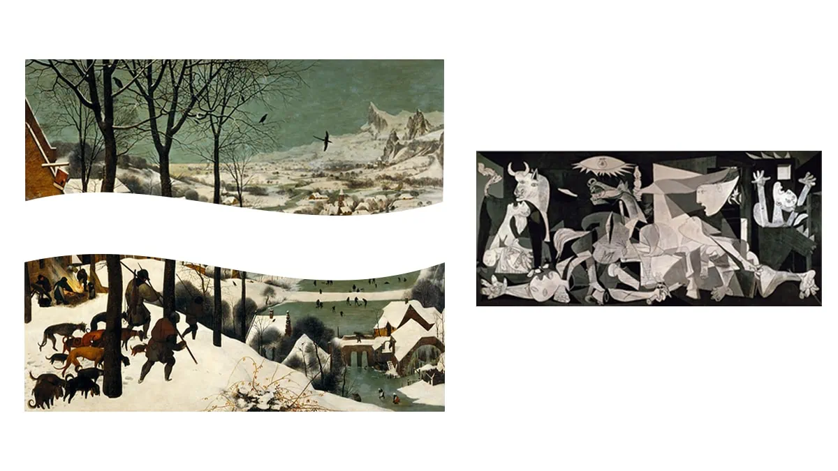
Pieter Brugel the Elder’s artwork The Hunters in the Snow can make the best deep space example.
Here, hunters and animals walk to the village, which encompasses villagers and some domesticated animals engrossed in their activities.
The view isn’t limited to the foreground; even the background is vividly seen. The composition is wide, third-dimensional, and filled with several focal points.
Shallow space in art, on the other hand, is flat, two dimensional art with limited or no scope for depth.
There’s minimal distinction between foreground and background; cubist style artworks can make the best example of shallow space elements.
From Pablo’s Guernica to Georges’s The Portuguese, their art lacks traditional principles of perspective and depth.
They are two dimensionally away from realism and inclined towards abstractionism.
Conclusion
Space separates elements and adds meaning to an entire piece. Its role is to draw the viewer’s attention to a focal point and make them comprehend what it speaks about.
Therefore, over the years, artists have used different kinds of space elements in order to captivate viewers and convey many complex messages in a convenient way.
Negative and positive spaces exist in all the compositions. The use of shallow and deep spaces is a matter of preference.
However, the element of space undoubtedly changes the rhythm of art, takes it to a different tangent, and surprisingly incorporates emotions that only the artist is familiar with.
Frequently Asked Questions
Positive, negative, deep, and shallow are the four kinds of space.
Space adds depth and meaning to a composition; it changes the way viewers comprehend art.
Negative art space elements make positive areas appear alive, active, and appealing. It lets viewers pay attention to the moving parts of the composition and comprehend its message.


